


So this is what dazzled at the Kitchen and Bath Industry Show in Las Vegas earlier in the year:
Refrigeration and wine coolers in emerald green from the luxury brand True wowed with equally untimid brass or copper pulls.
Brilliant crackled glossy tile in the same shade from Ann Sacks got sustainable as well as style points, as the product is made partially made from recycled material.
Plum, lavender and indigo sinks from Kohler reflected shades that have been prominent in home decor.
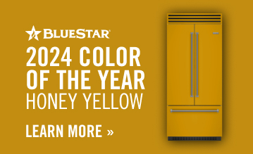
BlueStar, known for its wide range of colors, showed off Living Coral, the 2019 Pantone color of the year and teased with a prototype for a pattern: blue-and-white stripe with overlay floral and hint of plaid, designed by Jason Oliver Nixon and John Loecke from Madcap Cottage. Dolce and Gabbana’s ebullient patterns in vivid colors in the Sicily Is My Love collection for Smeg, now grace ranges and stove hoods, in addition to refrigerators and small appliances like mixers and toasters.
Wait, what? With a uniform of safe, neutral looks, especially in the kitchen — where the favorite styles translate to lots of white cabinets, Carrera marble and stainless steel — there’s a bit of a shakeup going on. While there have been the occasional pops of color (orange, cobalt blue, red), particularly in ranges, more manufacturers are testing the bold. But the rainbow of colors, which covers brights and muted hues, also stretched across appliances to expressions in cabinetry and surface materials.
The appetite for color has been growing across the home design landscape, invigorating shows in Paris, Frankfurt and Milan. What has been striking for trend-watchers is that while there are a few colors and patterns so dominant on textiles (like checks, animal prints and hippie-inspired tie-dyes currently on fashion runways), the utter exuberance of it all sometimes tipped into full-on maximalism.
Are we ready for color in the kitchen and bath? That actually fits right in with current buzzwords that are often bandied about — customization and bespoke.
Making it your own was one of the themes of last year’s EuroCucina, the biennial international kitchen and bath show held in tandem with the giant Salone del Mobile in Milan. Although modular forms popular in Europe have not made a huge dent in our styles, personalization is starting to gain traction in the U.S.
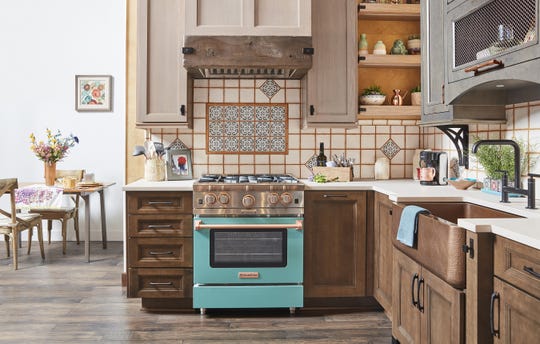
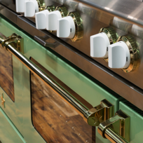
There is much more color in kitchens and baths, to be sure. And instead of stainless pulls on appliances, burnished brass, rose gold and copper are options, coinciding with a warming of metals. Black matte also is huge — especially paired with gold. Some vignettes at KBIS in Vegas were lessons in how to mix materials: natural and stained wood; painted matte or lacquered finishes; stone, porcelain and metals.
Kohler tapped into fashion and personality in introducing its rich palette, “understanding a desire for more color within the home setting.” Now Dacor offers DacorMatch Color Match, inviting consumers to “show your true colors — all of them,” by providing a swatch so the company can match its appliances to whatever is your jam. Victoria and Albert offers a color-match system used in Europe with 194 RAL colors, in addition to its existing six standard color offerings. The brand cites that Elle Decor has identified a trend for deep blues and greens, while Color Hive, a global color trend consultancy, is predicting the hottest colors will be a warm palette of apricots, tawny browns and parchment.
“Personalization is a response to social media and technology,” says John Loecke of the High Point, North Carolina-based Madcap Cottage, which designs products such as fabrics, wallcoverings, lighting, bedding and rugs. What people see, they want in their homes, he says, pointing out that digital printing also has opened the door to customization. The new tech, says BlueStar, means that virtually any image, text, print or pattern can be applied to a range, refrigerator or stove hood in a durable, smooth, satiny finish that can be easily cleaned.
“The options for colorful ranges and faucets didn’t exist 10 years ago,” says Nixon. “Now (with more choices), no one wants to be cookie cutter, with cabinetry exactly like the neighbors’. People want to have some fun. Feel fresh. Consumers now have the tools to do that.”
Dallas designer Caitlin Wilson (www.caitlinwilson.com) called the BlueStar Pigeon Blue range and matching custom hood she made the centerpiece of her kitchen her piece de resistance.
She wrote in her blog: “With tons of natural light and a traditional crisp, white aesthetic that glows when the sun hits, our space was invigorated with this fresh, blue statement piece.” She chose White Dove (Benjamin Moore OC-17) for cabinets and a contrasting natural oak island topped with Luccicoso marble for the backdrop. She specified antique brass accents and customized knobs in matching blue.
Angela Wellborn O’Neill, director of marketing and advertising for Wellborn Cabinets, says that new alternatives to stainless or white help people make statements in their kitchens.
“We cook with our senses — taste, touch, sight — so why not extend them to the room’s design, from the cabinets to the kitchen appliances?” O’Neill suggests.
“Bright, beautiful colors help accent the rest of the home,” says Jeremy Press, owner of Appliances by Design in Hilton Head, South Carolina. “The kitchen is so central to the functionality of a home. It’s only right that it should be the focal point of the design as well.”
That goes for the outdoors as well. A turquoise grill with rotisserie and a separate burner can inspire the color scheme for patio furnishings. Hestan, a California-based manufacturer with 12 signature colors in its appliance line, loves to gather insights on color from designers and those in the trade, as does Press.
While Nixon and Loecke welcome the idea of pattern in the kitchen and bath — they are the authors of “Prints Charming” (Abrams; $35), a tutorial to sparking joy with pattern-filled rooms — they say the key to it all is layering.
That’s what designers Damian and Britt Zunino, husband-and-wife partners of Studio DB (www.studiodb.com), did with the bathroom they designed for this year’s Kips Bay Decorator Show House in New York City. They started with Kohler’s new plum clawfoot soaking tub, which they set against a shimmery backdrop of a panther-patterned silver hand-painted paper by de Gournay. They described the space, that’s walls are Viridian Green from Benjamin Moore’s Century Collection, and that includes a sitting area and separate bath lined in beautiful patterned lavender and white tile, as “a sexy boudoir.”
Here again, pattern is taking on a bigger role, thanks to elegant hand-painted murals and porcelain tiles. The range in porcelain tile, quartz, stones, solid surface and laminate has not coincidentally beefed up. Manufacturers are exploring more exotic stones and unique, complex patterns, with swirls and rich, pronounced veining. Backlighting also has added another dimension, alongside translucent surfaces such as quartz and onyx. Vetrite’s Gem Glass collection, thin glass slabs created with polymer film that mimics precious stones and gems, is suitable for islands, backsplashes and furniture.
While color and pattern may be making themselves a little more comfortable in kitchens and baths, there’s still a fear factor. Remodeling these spaces is not for the faint of heart — especially if plumbing needs to be relocated. For that reason, choosing product — appliances, fixtures, surface materials, hardware, faucets — is a topic of angst and debate. Some of the deliberation is about style; the rest is about money.
But while you’re dreaming about your re-do, here are some ways to think about driving out of neutral:
- Make a statement. Choose your favorite color for the range and/or range hood and fridge. Or go bold with a colorful freestanding tub.
- Pop color onto a backsplash. Even if you can’t get past white or neutral cabinets, this can be a fabulous spot for exciting color and graphic pattern.
- Ground it. The floor is a wonderful canvas, especially for patterns. Geometric ones, like the range of concrete and porcelain tiles available, work well — if they’re not too busy.
- Center it. Focus on the island. Pattern can star here, and depending on what you choose, it can function as an art piece.
- Add texture. “Pattern is not just a color or a print — it can be a texture,” says John Loecke. Consider strong wood grains, 3-D tiles and sinks with relief aprons.
- Change it out. For a simple refresh, have a little fun with taps. Colorful modern options include the Hastings Vola series (www.hastingstilebath.com) and Grohe’s semi-pro kitchen faucets with interchangeable silicone hoses (www.grohe.com). Or swap out cabinetry hardware for a bit of color.


