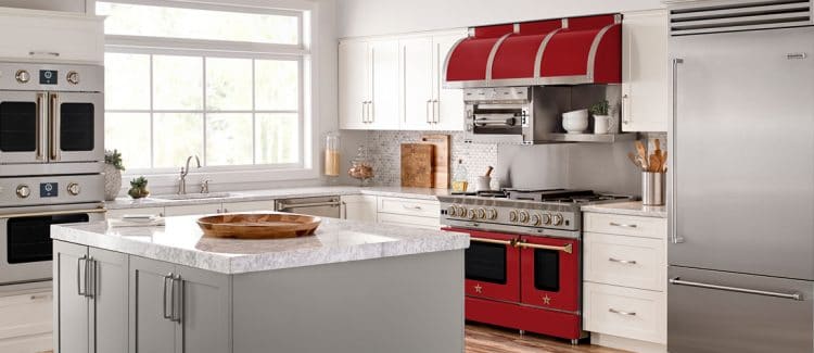
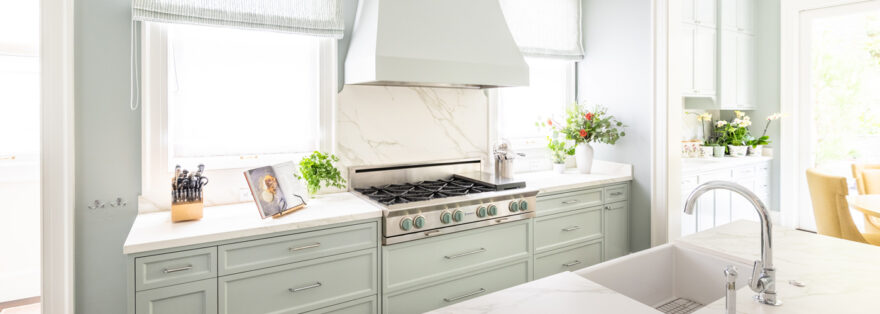
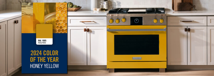
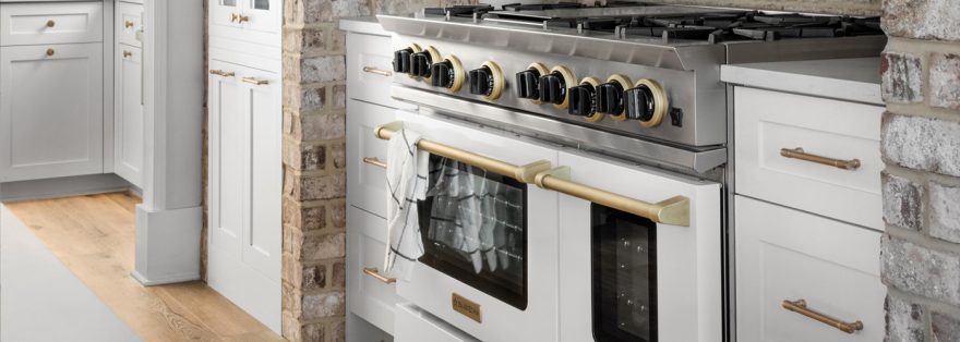
After decades of all-white palettes and clinical stainless steel, the rise of charismatic, hue-infused kitchen design is helping plucky homeowners stand out from the dreary pack
By Sarah Karnasiewicz
 Recently, in the midst of renovating my Brooklyn row house’s kitchen, I developed a crush on a slab of stone called pietra del cardosa, a dark blue sandstone with pale whorls like cosmic dust. Inky and imperfect, it struck me as the antidote to the morgue-like expanse of white marble that greeted me each time I scrolled Pinterest for kitchen-design ideas. Never mind that the surface was prone to staining: I had to have it. Messes and marks might happen, but I would proudly call them patina—and enjoy my moody blue counter.
Little did I know I was a trend setter. Though the clinical white-and-stainless-steel look has reigned for decades, with its aura of the professional chef’s kitchen and promise of cleanliness, a backlash is growing.
Take a closer look at shelter magazines and interior designers’ social-media feeds and you’ll see a new kind of luxury larder is generating buzz: one that’s riskier with color, accessorized by surfaces that visibly wear and age and, above all, more personal and idiosyncratic.
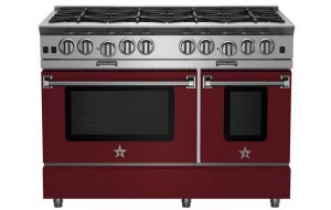
Manufacturers are feeling the shift. Viking Ranges is the company that in 1987 nearly single-handedly led the stainless-steel appliance invasion. In 2017, said brand communications manager Katy Coleman, sales of its color line—which encompasses two dozen bold finishes including cobalt blue, racing red, plum, sea glass and pumpkin—jumped by 31% over the previous year. Likewise, BlueStar, the manufacturer that introduced 190 range colorways in 2007, has seen the percentage of its sales from colored appliances grow steadily year over year.
While the midprice segment of the market tends to be more conservative, even there a new attitude is bubbling up. “When we talk to consumers about stainless steel, they’re saying it’s ubiquitous, it’s not special anymore,” explained Marc Hottenroth, industrial design leader for GE. In response, Mr. Hottenroth’s team in recent years added three new, more-dramatic colorways to their appliance lineup: slate (a warm, matte charcoal with earthy bronze undertones), a deep black slate and a rich black stainless steel. The reception, said Mr. Hottenroth, has significantly exceeded expectations.
According to Dallas designer Jean Liu, this shift in tastes may be an emotional reaction as much as an aesthetic one. “Let’s face it—the world has been a scary place this year,” Ms. Liu said. “Many of my clients are taking money they would have spent on travel and spending it on their house.” As a result, “kitchens get elevated from a functional to a focal space.”
One design publicist in Palm Springs, Calif., an older millennial who happens to be embarking on a kitchen remodeling, credits social media with triggering his thirst for individuality. “You can see a white-and-stainless kitchen on the most basic home-renovation show,” said Rich Pedine. “And then we saw it on blogs. And then on Instagram and Pinterest. Particularly given the color possibilities now, I personally want the big payoff of risk-taking.”
Designer Kati Curtis has noticed an uptick in clients’ receptiveness to the type of color choices that make a space unique. “In New York every kitchen has white or gray cabinets, a white or gray backsplash, white or gray floor tile and stainless appliances,” she said. “It’s almost a status symbol to have color and pattern in the kitchen now.”
Of course, that’s how these cycles work: Luxury designers embrace a look that trickles down to the mass market before ending up in every anodyne builder’s kitchen, thereby becoming a surefire way of dating a space. When I first saw my husband’s family’s “ Harvest Gold ” outer-borough New York kitchen, it was as good a proof of his age as his 1977 birth certificate.
Phyllis Taylor, a Miami designer and author of “Classic Florida Style,” urges clients to embrace the confidence—and prestige—that comes from creating a completely personal space, resale value be damned. With one recent project, for a pair of Miami Beach empty nesters who moved from their home of 50 years into an oceanfront high-rise, that meant cladding the kitchen in glossy panels lacquered in a saturated red. The inspiration? The wife’s prized Jaguar sedan. Paired with a walnut herringbone floor and metallic countertops, the look might not work for everyone—but that’s the point. “I tell clients I can only design for one person at a time,” said Ms. Taylor. “Let another person worry about whoever comes after them. And that resonates.”
New York designer Thom Filicia agrees. “I’m finding clients are more determined to create spaces that feel personality-driven, not store-bought, and color is a big part of that.” One approach, he said, is to see the kitchen as a continuation of the rest of the home, not a sterile, isolated nook—which, given the enduring popularity of open-plan living spaces, few actually are. In a Vail, Colo., vacation property Mr. Filicia designed (see D1), a cobalt blue as brilliant as the high-desert sky covers not only the kitchen millwork and the cooking range but every interior door in the house.
To be sure, the line between color that enlivens and color that irritates can be fine. To strike a balance, New York designer Tina Ramchandani suggested using neutral textured tile for a backsplash and letting colorful cabinetry do the talking. For Ms. Taylor, light is the crucial consideration. “In Florida we have phenomenal light—colors just seem to translate better. But you only learn that by experimenting,” she said. “I did a lime green kitchen that was stunning here—but in New York, a dark teal would look great. Color choices need to be local, not trendy, because light is different everywhere.” (Story continues below.)
What Your Kitchen Will Be Wearing This Year
Fixtures and faucets, too, are veering away from cold white porcelain and silver metals. “Stainless steel, flat-bottom, hard-corner kitchen sinks are a nightmare to clean and maintain,” said Kevin Kemper of H3K Design, in Palm Springs, Calif. “In their place, we are using a lot more fireclay and granite composite colored sinks.” Nashville designer Jonathan Savage sees brass as a incoming finish for sinks and hardware.
The kitchen equivalent of expertly distressed $500 jeans? “Living metals” such as unfinished brass. Amber Lewis, of Amber Interiors, trades the lab-like feel of stainless steel and the trendy flash of chrome or rose gold for accessories with a patinated charm that naturally ages. “I’m always thinking, how can we make this feel richer,” said the Los Angeles designer whose barefoot elegance might best be described as So-Cal meets Shropshire. “I don’t like surfaces that won’t live, so anytime I can use an unlacquered brass or copper, I will.”
Indeed, the rambling, mismatched manor-house kitchen aesthetic—think Downton Abbey with Wi-Fi—has never felt so au courant. Or accessible. After decades of catering to an exclusive U.K. and Continental clientele, the British firm Plain English—makers of custom kitchens in vibrant hues like “scullery latch” (robin’s egg blue) and “boiled egg” (a sunny, saturated yellow)—are opening their first U.S. office and a showroom in New York this April. Said the company’s design director, Merlin Wright, “I think we’ve had quite enough of the tasteful grays, haven’t we?”
RANGE OF COLORS // How the Modern American Hearth Has Evolved From Grim to Garish to Chilly—And What’s Next
1800s The first step away from open-hearth cooking, early commercial coal and wood-fired ranges are hulking cast-iron behemoths. They rule for centuries.
1920s-1930s As American culture grows preoccupied with efficiency and microbes, appliance makers take cues from laboratories, offering sterile surfaces like white porcelain and enamel.
1950s Slick refrigerators and ranges become middle-class fixtures, and manufacturers adopt bright colors—canary yellow, aqua, two-tone pink—inspired by automotive-industry trends.
1970s Earthier hues like harvest gold, avocado, burnt orange and chocolate brown reflect hippy-chic style and the influence of modern Scandinavian home accessories.
1980s Appliance giants phase out color-saturated finishes in favor of neutrals like almond and onyx—a high-sheen black that looks luxe against the decade’s minimalist kitchens.
1990s As cooking becomes a competitive sport, how better to outfit the sprawling open-plan kitchens of McMansions than with stainless steel, celebrity-chef-quality ranges?
TODAY Homeowners begin art-directing their homes and jockeying for “likes.” Design-forward brands like Smeg and BlueStar—which offers 750 colors—get buzzy.


