


Kitchen of the Week
Who lives here: A couple
Location: Seattle
Size: 290 square feet (27 square meters)
Designers: Harmony Weihs of Design Harmony (interior design) and Lauren Crocco (architecture)
The owners’ desire to bring in more light, create a social hub and handle a crowd inspired this kitchen addition to their Seattle home. “This couple loves to entertain and have lots of extended family nearby. They have 20-plus guests over on a regular basis, not just once or twice a year,” says interior designer Harmony Weihs, who had worked on other projects in the home and knew their tastes well. “Their home’s architecture is pretty traditional, but they lean more modern. Mixing styles in here made it more interesting,” she says.
Weihs and her clients used Houzz ideabooks to share their visions for the space. “I always use Houzz,” she says. “It helps me see what’s important to my clients. And if they need a little push outside of their comfort zone, I can show them examples that are similar to what I’m proposing.
“I collaborated with architect Lauren Crocco on the addition — we worked in tandem, with her concentrating on the exterior, while I worked on the interior,” Weihs says. Lewis Construction Group made the design come to life.
The roofline of the addition extends beyond the kitchen to form a covered porch where the owners are planning to set up a barbecue and bar as the next phase of the project.
Dining Zone
The designers also transformed the former kitchen into this dining area. Relocating the kitchen appliances and cabinets provided a wonderful opportunity to add a trio of windows to let in the natural light, which is important in a city that has so many gray days.
“While designing, we had to consider the two of them there every day as well as how it would handle 22 people,” Weihs says. For large get-togethers, the space can accommodate two dining tables set up parallel to the custom leather banquette.
“They aren’t huge TV people, but they knew that when they have parties, everyone ends up in the kitchen, so they wanted to be able to put on the game or run a scroll of family photos on this wall,” Weihs says. “I dressed it up with the sconces, and it kind of disappears into the dark wall color.”
The dining area has a flat, 8-foot ceiling, something the homeowners were excited to improve upon in the kitchen addition. “This was tricky because they have a second story that needed to work with the addition’s roofline,” Weihs says. Crocco designed a roofline that allows the kitchen ceiling to vault from 9 feet, 4 inches high at the back of the house up to 11 feet high where it meets the dining room.
The vaulted ceiling makes the kitchen feel airy and bright. It’s covered in tongue-and-groove paneling, a traditional material that’s more striking than drywall.
Prep and Cleanup Zone
Chopping vegetables and washing dishes aren’t so bad with a beautiful view out to a private backyard. This wall of windows is one of the kitchen’s most important features. Collaboration between architect and interior designer was critical: Crocco figured out how to structurally fit in as many windows as possible, and Weihs centered the undermount sink on the windows, creating a focal point with outside views. Four large skylights brighten the room even more.
The white cabinets are a classic and versatile Shaker style. The countertops are Luce di Luna quartzite, a natural stone that resembles marble and is more durable than granite. They have a contemporary square profile and, at 2½ inches, are almost twice the usual thickness. “Next to the other large-scale elements in this room, standard thickness would have looked wimpy,” Weihs says. The matte black faucet and cabinet hardware play off the black window frames.
Gathering Zone
A 6¼-by-6¼-foot island is the heart of the kitchen. “I really wanted them to have a square island because it’s modern and different from most islands you see today,” Weihs says. Sky blue paint adds color to the room and makes the island stand out as the centerpiece.
The brass ring chandelier overhead is pleasingly scaled in relationship to the island. It also brings a circle into a room full of squared-off edges.
Seating wraps a corner of the island, facilitating conversation. “It was key to fit four counter stools in here,” Weihs says. She thought carefully about the large groups that would gather around the island when she sized it and placed it in the plans. “The minimum space I would ever leave is 36 inches around an island — that’s hallway width — but I like to leave more whenever possible,” she says. “The 48 inches here is more comfortably roomy.” It leaves space for people to walk by one another or past open drawers or appliance doors.
Cooking Zone
The work side of the island provides lots of countertop space across from the refrigerator and range. It contains the microwave drawer and steam ovens. The side of the island facing the sink has deep drawers for storing pots and pans.
There are other lights in addition to the ring chandelier: simple clear glass-and-brass globe sconces, coffee bar lighting and recessed ceiling lights.
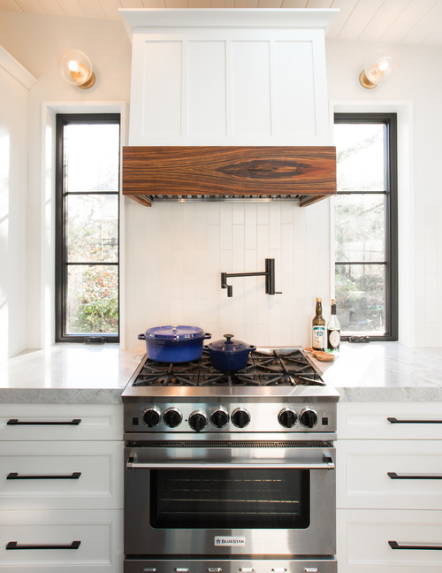
The elongated subway tile on the backsplash comes from Heath Ceramics. The vertical orientation draws the eye up to the custom tiger wood detail on the vent hood. The color of the tile is so subtle and similar to the wall paint that it’s hard to see on other photos, but the overall backsplash is extra high and lines up with the height of the range backsplash. “Choosing a subtle backsplash really made the windows pop,” Weihs says.
She made sure to include plenty of work and prep countertop space close to the range. The cabinets around the range are specially outfitted for herbs and spices on the left and cooking utensils on the right.
“These homeowners are really into their coffee. They have a commercial-grade espresso maker, and they even roast their own beans,” Weihs says. With that in mind, she set up a coffee bar complete with its own bar sink and room for supplies. The tall cabinet on the left is a pantry cabinet.
The area stands out in a few ways. Weihs designed a custom open shelf with matching corbels in the same quartzite as the countertops. Puck lights illuminate the shelf and backsplash, which is the same color as the backsplash elsewhere, but in hexagonal tile instead of the elongated subway tile.
A Place for Wine Too
Here is the view of the dining room from the new kitchen. The tall cabinet on the left is for wine and linen storage.
On the floor plan, the dining room is at the bottom left, and the kitchen addition is above it. The covered patio is in the top right corner; you can see the door to it to the left of the coffee bar area.
Takeaways
- Make a TV seem to disappear by mounting it on a dark wall.
- Help draw the eye to the views outside with dark window trim against light walls.
- Consider a thick and square countertop profile for a more modern look.
- Make sure that an island has enough space around it for you to function the way you like to in a kitchen. And remember to think about how much space there will be when a dishwasher or oven door is open.
- Designate spots to keep oils, spices, seasonings and cooking utensils close to the range but not too near the heat source.


