


At the recent Heimtextil, the largest international show for home and interior textiles at Messe Frankfurt in Germany, one booth at the annual trends exhibition got a spirited conversation going.
It was about color and the conclusion was one that surprised. Red was framed as a relaxing color, with evolving spectrums from pink to saturated oxblood, creating a warm glow in interiors, “wrapping inhabitants in a comforting blanket that promises relaxation and calm.”
Blue, conversely, was described as stimulating. “Washes of clear, cool blue tones imbue designs with clarity and purpose. Gradients of the color are applied to materials that trap, refract and reflect light, enhancing their ephemeral impact, in order to invigorate and awaken.”
Exploring trends from all over the world — colors, patterns, materials, topics like micro home or remade upcycling pavilions or craftsmanship ateliers — is part of the must-see theme park organized each year, says Thimo Schwenzfeier, director of marketing communications for Messe Frankfurt. This year’s message: The Future is Urban.
One trend and design studio, Franklin Till, studied research on circadian rhythms and how they relate to sleep and stress. The firm’s insight: “It has been suggested that blue light negatively affects the production of melatonin, a hormone that plays a key role in regulating sleep patterns, while warm red light aids its production. So, contrary to popular belief, scientific research has proven that blue light stimulates, while red light calms us — which is why we are always advised not to go near blue-light screens before going to bed.”
Curious, then, are some of the choices for color of the year. On one side, Pantone led with Ultra Violet — a mix of red and blue. Paint manufacturer Benjamin Moore opted for red, specifically, Caliente, AF-290.
A team of seven Benjamin Moore researchers visited 30 cities in 12 countries, attended 23 industry shows and reviewed more than 42,000 pictures to come to this pick. Here are the words they use to describe this color: Radical. Dramatic. Happy. Smart. Desire. Primary. Symbolic. Confidence.
“Caliente is the signature color of a modern architectural masterpiece,” says Ellen O’Neill of Benjamin Moore. “(It’s) a lush carpet rolled out for a grand arrival; the assured backdrop for a book-lined library; a powerful first impression on a glossy front door. The eye can’t help but follow its bold strokes. Harness the vitality.”
There always have been avid aficionados of both red and blue, whether it’s in clothing or interiors. And each color, solo, can be explosive — think Yves Klein blue, that electric signature shade of cobalt, or fire engine red.
Is there any other color but red that says Ferrari? And how about a red cocktail dress in a sea of safe black? And though hot peppers can be green, we mostly think red when we hear “caliente.”
Couture rug designer Emma Gardner is on board with her new “Splash” rug, a romantic and painterly pattern with a watercolory look emphasized by the combination of silk with wool.
“Lucky for us, a rich range of reds is back, bringing energy and vivacity to interiors,” she says. “Chili red is caliente. When combined with muted tones, it can happily play an accent role, blending graciously into a softer overall environment.”
When Chicago designer Elissa Morgante of Morgante-Wilson Architects worked with a client who was “all about color,” for the interiors of her home, there was one room she was set on.
“She wanted a red dining room,” says Morgante, “because the color is very active, gets your juices running.”
Morgante, though, admitted it’s hard to get people to jump into using a lot of red. “There’s more comfort in doing a red pillow than a red sofa.”
Caitie and Maureen Smithe of Walter E. Smithe Furniture in Chicago are excited about incorporating reds. They see Caliente as bold and seductive, radiant and reassuring. For those who want to embrace the trend but not fully commit, they recommend painting your front door red “for the most inviting entrance in the neighborhood.”
“Pair red with trendy golds for a glam look,” say the Smithes. “Or tone it down with subtle grays or neutrals to bring out its warm undertone. Spice up your eating area by bringing in some of the hue with table linens and accessories.”
While a red kitchen counter might be an option, some might be more comfortable with a red-striped towel. Here are some other ways to introduce red:
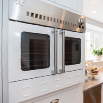
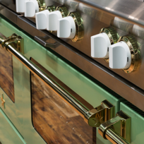
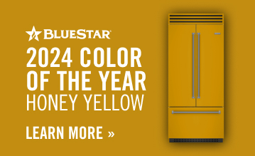
■Consider appliances. It can be a small one like a mixer (KitchenAid offers the largest range of hues) or a toaster. But reds have been part of a larger appliance line at Bertazzoni and BlueStar. The latter pays attention to fashion colors (its other big introduction this year is Pantone’s color of the year, Ultra Violet). Their colors extend to range hoods and now refrigerators. Of course, Wolf ranges offer the option of its trademarked red knobs, a signature since 1933. These can be a launch point for materials like tile, hardware and accessories. And Smeg, which features red across its line of 1950s-inspired small and large appliances, recently teamed up with Fiat to produce a beverage refrigerator using actual Fiat 500 parts (one color choice, of course, is red). Fair warning: It’s no novelty, and meticulously crafted with a $12,000 price tag.
■Choose a piece of furniture. So many are leery of integrating bold red seating into a room. But a single chair, sofa or cabinet can be a fabulous statement piece. Consider the medium, as well. Stained or lacquered wood, matte or with a sheen, even high-gloss, as in an angular cocktail table from Roche Bobois or in a red combined with clear acrylic Chinese-inspired bench at Pagoda Red. Powder-coated aluminum is another option, one also suitable for adding a jolt to the outdoor room. One handsome bench designed by Russell Woodard for Woodard Furniture is available at Design Within Reach. Or you might be seduced by a more traditional tufted sofa called Alexis from Walter E. Smithe.
■Light up with red. Glass, resin, metal or even paper shades can be striking on wall sconces or pendant lighting. Or use a mobile or a red mirror, especially in an unusual shape, to introduce a little fun.
■Think about the bath. Imagine the wow of a red faucet. Architect Arne Jacobsen actually did 40 years ago when he designed the Vola faucet — still timeless and energizing. The recent popularity of freestanding tubs also has inspired some dramatic color combinations.
■Step on it. An area rug, solid or patterned in red, can engage, even in smaller sizes like doormats or runners.
■Tile or solid surfaces lend pizzazz. A shower wall, backsplash, floor or countertop in red is dynamic, even in geometric or patterned compositions with other colors.
■Add art. Draw your attention to the walls with art, from monochromatic to red-dominant.
Whether you think of salsa when you think of red — hot hot hot — or perceive it as mellow cocooning hue that’s more chill, with all the choices in so many areas of design, it’ll be a cool one.


