


Date posted: January 28, 2026
Each year, designers and trend‑watchers look forward to the moment when major color experts unveil their Colors of the Year. A handful of standout shades inevitably take center stage, shaping everything from fashion and interiors to product design and sparking fresh creative direction.
Color trends influence us more than we realize—they shape atmosphere, evoke emotion, and often reflect broader cultural movements. A Color of the Year becomes a snapshot of the collective mindset, capturing the spirit and aspirations of the moment, which is why its debut always generates so much excitement.
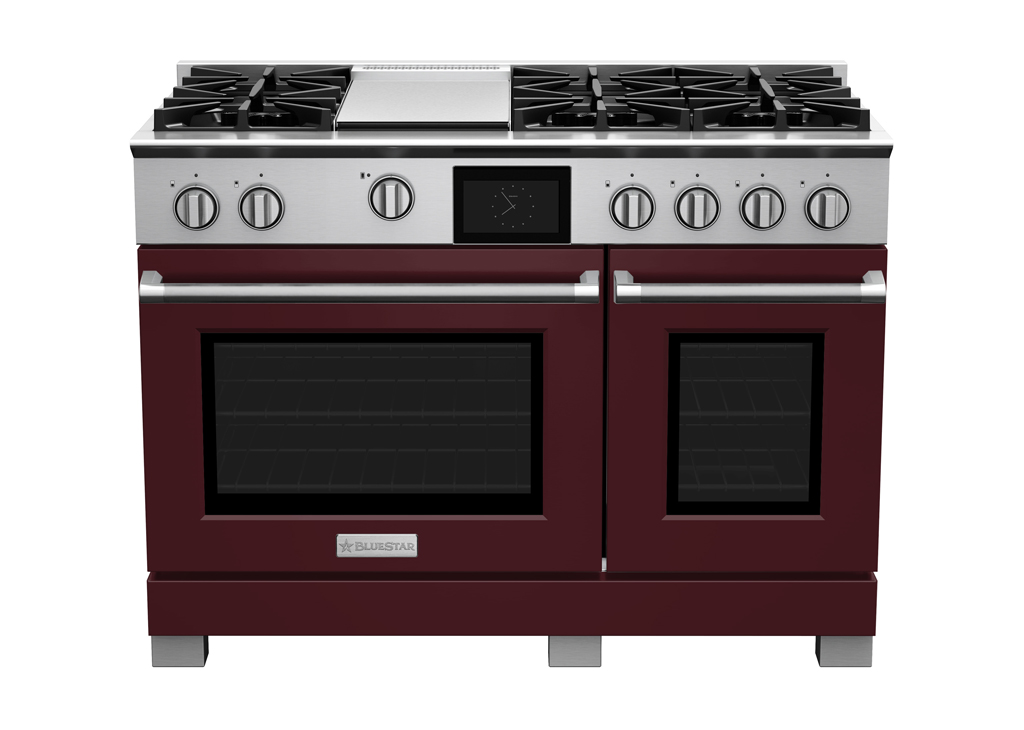
BlueStar | Purple Violet
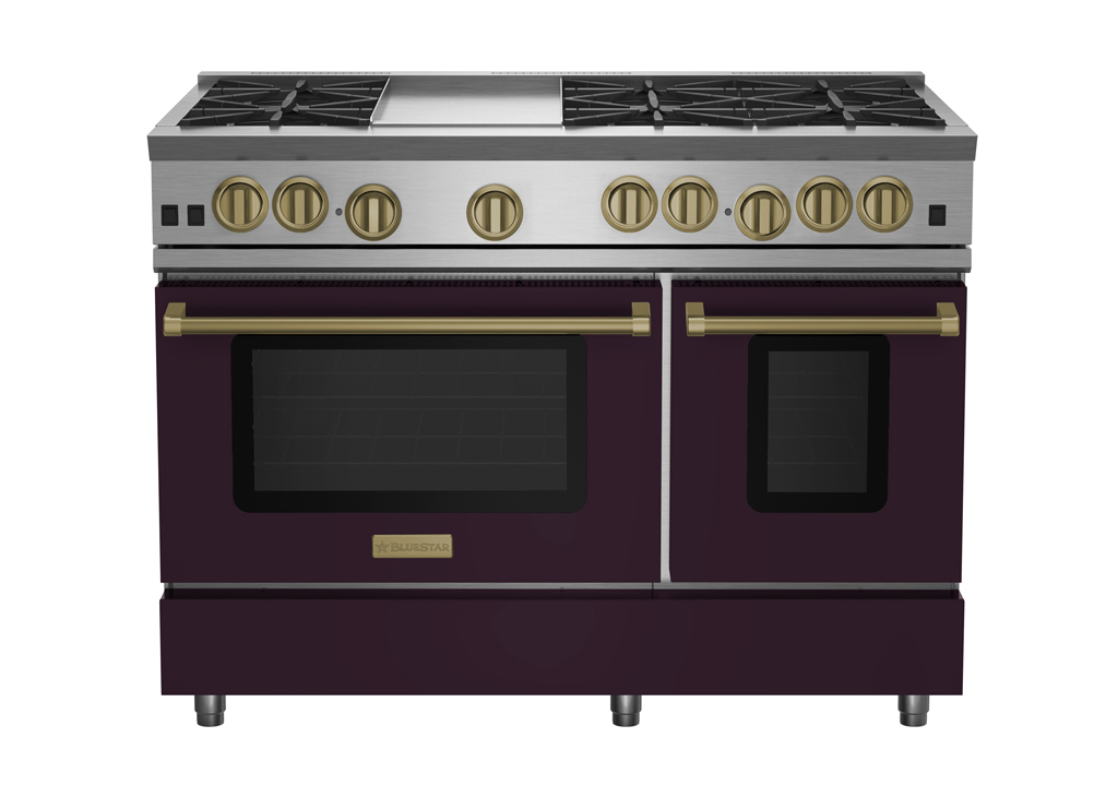
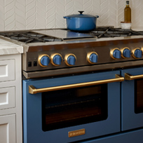
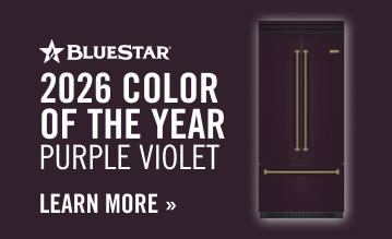
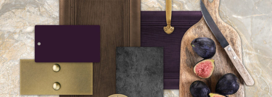
BlueStar has unveiled Purple Violet (RAL #4007) as its 2026 Color of the Year, chosen in collaboration with Shumaker Design Associates. The deep, earthy purple reflects a growing design shift toward richer, more emotionally resonant hues that balance comfort with bold expression. Inspired by emerging fashion trends and the continued popularity of warm, grounded tones, Purple Violet offers a sophisticated yet cozy aesthetic for kitchens—pairing beautifully with brass hardware, dark woods, and complementary blues and greens. Its real strength lies in how adaptable it is—bold enough to anchor a statement range, yet subtle enough to shape warm, cocooning spaces throughout the home—underscoring the brand’s dedication to craftsmanship, personalization, and thoughtfully designed appliances.
Benjamin Moore | Silhouette
Benjamin Moore has introduced Silhouette as its 2026 Color of the Year, a rich espresso‑meets‑charcoal shade inspired by the renewed popularity of classic tailoring in fashion and interiors. The hue leads an eight‑color trend palette that blends soft pales, warm midtones, and grounded neutrals, all chosen for their ability to layer beautifully and bring a sense of craftsmanship and quiet sophistication to a space. Together, the collection reflects a shift toward timeless design—where thoughtful details, depth, and understated luxury shape the mood of the modern home.
Sherwin-Williams | Universal Khaki

Sherwin-Williams has selected Universal Khaki as its 2026 Color of the Year, spotlighting a warm, mid‑tone neutral designed to bring calm, longevity, and effortless style to modern spaces. The shade leans into simplicity and comfort, offering a grounded backdrop that works across design styles—from contemporary minimalism to classic, layered interiors. Sherwin-Williams’ color experts describe Universal Khaki as a versatile essential that reflects a growing desire for timeless, nature‑inspired hues that make everyday living feel more intentional and beautifully understated.
Behr | Hidden Gem
Behr has introduced Hidden Gem, a smoky jade green chosen for its calm, refined presence and ability to elevate a room without overwhelming it. The color reflects a growing desire for interiors that feel grounded, elegant, and quietly luxurious, offering a balance of richness and restraint. Behr positions Hidden Gem as a versatile backdrop that works across styles, from modern minimalism to more traditional spaces, and highlights its ability to pair seamlessly with warm woods, soft neutrals, and brushed metallics. The announcement underscores the brand’s focus on timeless sophistication and creating palettes that support thoughtful, enduring design.
Graham & Brown | Divine Damson
Graham & Brown’s 2026 Color of the Year, Divine Damson, is introduced as a deep, luxurious damson hue designed to bring richness and sophistication to modern interiors. The shade’s moody depth makes it adaptable across styles, offering a dramatic yet timeless backdrop that works just as well in bold, statement‑making rooms as in more understated, elegant spaces. Available as paint and in made‑to‑measure soft furnishings, Divine Damson reflects a growing appetite for colors that feel both comforting and refined—an elevated neutral with a touch of opulence

