


My first thought was that it was ugly. And wrong. The house was ugly and wrong. Six years ago, standing on the curb, a baby on each hip, a ten-year-old by my side, in the shade of a for sale sign, all I could think was: What an ugly, wrong house.
A rambling 8,400-square-foot behemoth the color of pea soup, it was a mess, an illogical pairing of design styles. The front had a Santa Barbara mission façade, complete with hulk-ing dark-wood balconies. The back was light, distinctly Italian with ornate archways and carved stone. It was as if the powers that be had, on a whim, sliced two different homes down the middle and glued opposing halves together. The result was too off-kilter to be considered quirky and too confusing to be deemed eccentric. Things were only slightly better inside. With their original doors and moldings, the living room and library were stunning. But most of the rooms were devoid of sunlight and had doors in problematic places. Wrong, I muttered to myself. And ugly. Why would I want this wrong, ugly house?
As someone who spends most of her days crafting stories for television (Grey’s Anatomy, Scandal, How to Get Away with Murder, etc.), I can only explain it like this: The house felt like . . . good story. And every inch of me wanted to write it.
That’s my problem. I love a good story. I get seduced by story every time. So even though I was a busy single mother with three kids, four television shows, and a company to run, and I should have known better, I didn’t stop myself. I bought the house anyway. And then I simply decided to assume the story would have a happy ending.
To begin, I worked with architect Bill Baldwin of HartmanBaldwin. We got lucky. Bill found out that sometime in the 1950s or 1960s, an overenthusiastic homeowner had recklessly removed the home’s original façade and replaced it with the out-of-sync one. We also learned that the home was actually built in 1923, the work of Elmer Grey, the famed architect of the Beverly Hills Hotel. With a little research, I located photos of the original exterior. They revealed the front as Grey had intended— a beautiful Italianate villa with an intricate stone-carved balustrade. I live in a Historic Preservation Zone, and somehow the house had mistakenly received a historic designation with this fake Santa Barbara mission front on it. So the first thing we did was ask the Office of Historic Resources staff to research and correct the issue. Once that was done, we were able to get down to the business of restoring the house to its original glory. The old photos we had found were sent to a stonemason in Chicago, and he re-created every detail of the original front exterior.
Enter Michael Smith. I’d had the opportunity to visit the White House residence during the Obama era, and I had been impressed by how warm, comfortable, and elegant it was. I was especially enthusiastic about President Obama’s private office—the colors, the style, the vibe. I wanted to sit and write in there. (I didn’t.) Anyone who can make a writer feel more like writing is someone special. That ability to connect with whatever creates sparks in a person is part of what makes Michael such a gifted designer. Working with him was a truly collaborative experience. Despite my lack of time, I ended up being deeply involved in the process. The home we’ve created feels classic California—if a little bit romantic.
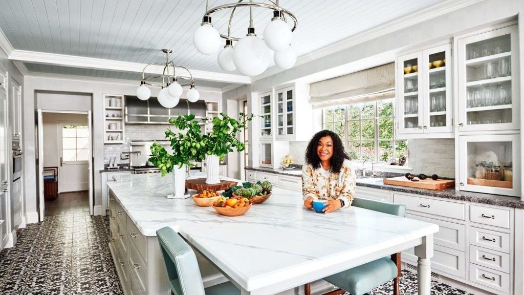
First Michael worked with everyone to deal with my biggest concern: the lack of sunlight. To start, HartmanBaldwin blew out the roof of the first-floor loggia, creating a two-story gallery along the back that fills the whole space with light and air. The gallery is lined with big glass-and-iron doors. Previously those doors opened into the house; now we’ve turned them so that they open out onto the patio. This adds about three feet of furniture space to the room, lending it a sense of spaciousness. My favorite thing to do when entertaining is open all of those doors and enjoy an indoor/outdoor dance party. We also changed the feeling of the front hall, which had been cavernous and dark. Michael persuaded me to replace the wood front door with a glass one, which means that sunshine streams in every morning. The last and biggest thing the team did to address the darkness issue was to add skylights with custom hand-blown glass up and down the second-floor hallway. Now every inch of the home is infused with light.
Michael and I also made some other important choices. I wanted to maintain what was original—the library, living room, front hall, and stairs—with some improvements. I’d found photos of the living room showing that it had had a coffered ceiling, so Michael painstakingly re-created that look. In the library, the television was removed from the cabinet and extra shelves were built in to give me more space for books and my vintage record-album collection. The flooring in the front hall was replaced. The new marble floor is beautiful, and to my continuing delight, it is also heated.
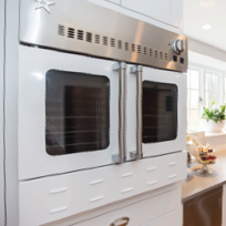
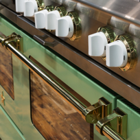
A big kitchen was key to the comfort of this house. My family is a kitchen family—I host holidays at my house, and on a daily basis my kids and I can be found hanging out in here. So I needed a big, comfortable kitchen we could relax and spread out in. Bill imagined it as a seamless addition to the home with a family room next door. Michael designed a large, airy space, adding black-and-white tile from Native Tile and a BlueStar Heritage 60-inch range. The end result is the kitchen of my dreams. I don’t even complain about washing dishes in this kitchen. How can anyone complain in this much beauty?


