


Pattern, color, and a dreamy patio!
This new sense of openness worked perfectly for the client—who often entertains up to 20 people in the space—but called for a very particular palette to ground it. “It needed some richness,” Bliss explains.
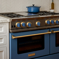
Cabinetry in a deep shade of blue is topped with hand-painted terra-cotta tile wall from Waterworks, which pays homage to the house’s Spanish architectural style (“The old kitchen did not have any style at all,” laughs the designer). Bliss opted for brass hardware and dark wood floors to add texture, then incorporated a healthy dose of black on the range hood, the shades of the double-light pendant, and the window and door frames. “Black is a grounding color,” she explains.
The kitchen isn’t all about looks, though—far from it. “She wanted the kitchen to be beautiful, but she really needed it to be functional,” says Bliss. The best example? The countertops. “It was all about durability,” Bliss says of her selections. She opted for quartzite—a durable alternative to marble that looks just like it—around the room and then a wood butcher’s block atop the island.
“The wood warms everything up and it’s really practical for cooking,” Bliss says. “And then a few steps down is kind of her baking zone, so we have the quartz again which is good for rolling dough.”
Another practical measure that happens to be stylish? The wire-front upper cabinets. “You don’t have to worry about keeping things perfect in there because you’re not seeing everything,” says the designer. The clients can use them for the less pretty kitchen necessities, while the two open shelves hold accents and accessories.
“It’s all about that balance between the beautiful and the practical,” says Bliss.


